Click here to see Our Film

Wednesday 27 February 2013
Sunday 24 February 2013
Alex - Evaluation
1. In what way does your media product use, develop or challenge forms and conventions of real media products?
Short Film
At the beginning of the short film process we had a research task. During this task i found a few inspirational films; A Deafening Story, Angry Bird, Love Sick and Believe. These four films gave me ideas like shot types and angles, narrative and sound to carry into my own group short film project.
The film that gave me the most inspiration and ideas was Love Sick. The subtle comedy factor and social realism i felt could be interpreted and developed into my groups short film as they were very effective. I feel that our short film 'Game Over' uses the conventions of social realism as anyone can relate to the opening scene of coming in from work/college etc and go through the routine of getting out the car, unlocking the front door, making tea/coffee and then sitting down and relaxing. The other aspect i thought we incorporated well was the subtle comedy, one scene in particular is the conversation at the table where Mario chugs a whole cup of boiling tea. Having Mario go back into the gaming work to save Princess Peach challenges the codes and conventions of social realism and it is obviously not possible to go into a game. I feel our short films blends the lines between reality and make believe by using social realism but in parts incorporating and developing make believe parts from Sci Fi films.

Narrative
Short films contain the most inventive and unconventional work to be found in film making, this is because they need to entertain,excite and maybe send a message of what the film is about in such a short amount of time.
The narratives in the three films above from a nine frame analysis all use a linear narrative. This means that the story line runs smoothly without going off into other directions like a non linear narrative where a flash back happens. An example of this can been seen in a film called 'Apricot' which can be seen HERE. Using a linear narrative gives the audience a better idea of understand what is going on without chopping and changing between different times for example. Our idea of having a character from a different time/place came from the film 'Apricot' where having a character from the past in a present setting. We developed that idea, but for our film we had a character from the virtual world come into reality.
Characterisation
Our main character is probably one of the most well know in the video game industry. Using Super Mario was a good way for our target audience to connect to this film as most of us know Super Mario from their childhood or from the present day. Not many film i know of have used game characters as their main characters, not any Hollywood blockbusters in the past few years anyway. This challenges the codes and conventions of characterisation as its very rare to see a game character in a film.
Themes

One of the main themes in our short film was relationship. The relationship between Mario and the Gamer can be seen from little interactions like the 'high five' (pictured above) and at the end where the gamer has a tearful moment of remembrance from is now gone friend Mario. This idea of relationships came from the last film of the 9 frame analysis 'Love Sick'. We used and developed that idea of relationship to make it work as the audience would be able to relate to it is some shape or form.

Narrative
The narrative of our film is linear. within it, it has a resemblance of a circular narrative as you start and end in the same location. Todorov's theory 'the three stages' could in a way be applied to our short film. Todorov's theory involves three stages; Equilibrium, Disruption and Resolution. How this theory can be applied to 'Game Over' is as follows.
Equilibrium - Mario enjoying reality
Disruption - Bowser capturing Princess Peach
Resolution - Mario Going back into Game World
Genre
'Game Over' in terms of genre is a Hybrid, its a hybrid of comedy and social realism. Rick Altman wrote a paper which focused on two things. Semantic and Syntactic. A way in which your film can follow Semantic conventions of a genre is by characters, iconography, locations, props, music and so on. In 'Game Over' we have certainly covered this as we have used a big gaming icon which is 'Super Mario' which a lot of people would know. Not having the correct costume wouldn't covey the character of super Mario as he is recognised by his red and blue boiler suit and accent. A way in which a film can be Syntactic is by seeing which elements are used in a films narrative of that specific genre. For example in a romantic comedy you'd expect the two main characters meeting, a separation or falling out, they find each other or make up and then live happy ever after. For 'Game Over' you can see little elements of this as you see a persons daily routine which could mirror the audiences by when people make cups of tea, sit down and relax and play games for example.
Ancillary Tasks
Poster

We were set a task to analyse some film posters to see what content they had on and to comment on why they used certain colours and images. Click HERE to view a couple of poster analysis. (to view text on posters click on the image)
Poster Conventions
Title
The title of the film is always the biggest text on the page. The style of it sometimes gives away the vibe of the film. For example my film 'Game Over' uses playful text which can be linked toward the gaming style.
Image
The image is always the main focus of the poster, it's the first thing that attracts the viewers attention. It will relate to the genre of film, for example if it was an action film the character(s) will either be in action or striking an action pose. 9/10 the poster has the main characters on the front which sells the film to fans of the actors within the film.
Reviews
Reviews of the poster can tell who the target audience for the film is. Newspapers like the guardian suggest an educated audience and the Daily Mail could suggest a female target audience as the Daily Mails readership dominated by females. The reason we used 'The Guardian' and 'Empire' on our film poster is because they both suggest well educated audience. Empire was an obvious choice to put on the poster reviews as they are a film based magazine.
Production Company
Having the production company or director on the poster can add credibility, people of that company/persons fan base would be attracted to it. Similar to actors on a poster.
Website
Having a website link on your poster can advertise other 'special' features and tasters for the film. For example if we actually had a website for our film, the type of content we'd have on it would be; Trailer, Film themed games, pictures of set action etc.
Credit Block
The credit block tells you the most important people involved in the film. It includes the director, editors, actors etc. The reason why this is important to be on the poster is similar to previously said above, it tells the audience who's involved thus which would excite the fans of the director and actors.
Tag Line
Tag lines are sometimes used on posters to have something memorable to hook the reader. It is always linked to the film, may be a quote from the film or a short catchy hook.
Our Film
Our film poster follows many conventions of the film posters analysed above. One of which being that the main character(s) is a large image which makes them the main focus of the poster. The other major thing we found out by researching was that the tittle of the film was always the largest text on the page, this would be because they wanted you to see what the film is called. The other notable aspect to comment on was that a lot of posters had the name of the actors and sometimes the director, this would give the audience a chance to think. If they liked a film that the director made previously or the actor in it then they might give it a watch.
The most rewarding feeling about the finished poster product is that we unconsciously create an image which represents the jump from fiction (the background) to the real world. (the leap action)
One thing i would add onto the poster is a national lottery logo, this would suggest we were lottery funded. But not all short film are funded that way. Most short films are self financed.

Here is our final version of the film poster. As you can see this follows the conventions of any film poster. The main character is a large image and the Film little is the biggest text on the page. Left of the page below his elbow you can see the two actors featured in this film which also features in a lot of big film posters. The quotes from newspapers and magazines on the right shows you what comments people have of the film and what you can expect from it.
Having a structured poster is vital for the presentation to look perfect. Using theoretical lines on the sides to align text to images makes posters look neet. For example the 'G' of game over is perfectly in line with his elbow on the left.
Review


The Little White Lies review structure and format is very specific, they have their very own 'House Style'. They have a word count of 550 words. Their traditional layout is featured above with a landscape screen shot of a scene at the top, title below with the director and others featured below. The main article is cut into two and a half columns The first letter of the review is bigger and bolder compared to the others. A quirky feature is a rating system out of 5 with a few comment on three subjects which are; Anticipation, Enjoyment and In Retrospect. We mirrored this layout and format and the finished products is below. Aside from the layout structure their language is full of adjectives. They use sentences that if you knew what they were describing from a scene of a film that you'd feel intelligent and in the know.

2. How effective is the combination of your main product and your ancillary tasks?
3. What have you learnt from your audience feedback?
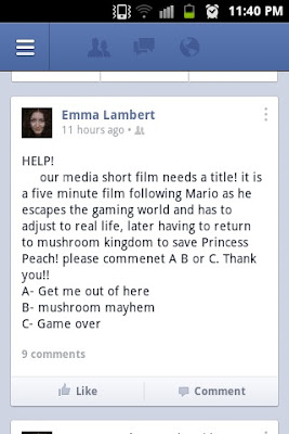
Our target audience is between 13-21 year old. Being in this age bracket it was very easy to get audience feedback. We did this by posting on social networking sites such as Facebook and Twitter and ask questions and then look at the replies. It's a shame Facebook took away their poll feature as it would of been very handy in this circumstance

The first question we asked was which film title they preferred. We had three names and one name we thought would fit but we put it down to our audience to finalise the decision.
'Game Over' got the most votes which was closely followed 'Mushroom Kingdom' then sadly last was 'Get Me Out Of Here'
The audience simple commented on the post with the letter they preferred. As i mentioned earlier it would have been great for Facebook to still have their poll application as it would have been better to use. We could have used a third party survey like 'Servey Monkey' but that would have been too many clicks for the audience to do.

To get some feedback on which poster to use we decided to use another Social networking site called Twitter. We posted images of the Two designs and waited for feedback which thankfully turned out to be the one we all loved the most.
Whilst in the final stages of the editing process we had a little disagreement on whether to feature some game footage at the beginning to give the into some kind of context before the title. we had a quick meeting and decided to go round our A2 Media class and asked for their opinion. One person asked whether the film needed game footage. After the results came in we still had the overall decision to make, but we all agreed that it would be in interesting opening to our film.

4. How did you use new media technologies in the construction, and research, planning and evaluation stages?
Jonah - Evaluation
In what ways does your media product use, develop or challenge forms and conventions of real media products?
- Short films by their nature are unique, with no two short films same, forms and standard conventions and hard to pin down apart from one convention that each film tackles differently, of being individualistic. Our short film does follow that one form by being quirky and inventive.

- The narrative of our film follows a short but entertaining journey of a much loved and famous video character Mario, from "Super Mario Bro.", the narrative is chronological follows a traditional short film plot.
- My short film follows Todorovs narrative theory by starting with the Equilibrium (Gamer comes home after normal day of college and sits down to watch tv as normal) Mario coming out of the tv is the Disruption, the gamer Recognizes the disruption by finding Mario when reentering the room. Together Mario and the gamer Attempt to repair the damage by trying to get mario back into the game. Mario returns to the game and the gamer reaches a New equilibrium because he has experienced something new that has changed him as a person and thus changing is normality/equilibrium.
- Because short films are so unique not just one single film gave me inspiration for my short film, but a selection of short films such as "Dream Girl" - "Sprokett" - "Table 7" (Pictured above)
- I liked Dream Girl because there was no dialogue, because it wasn't needed, you understand and can get the full impact of the short but sweet narrative. This gave me inspiration to make a short film without dialogue, but because I focused on a video game character coming to life this would have been near impossible to show and enable the audience to understand what is happening.
- Camerawork was important when creating this film as I had to convey what was happening in the first 1m30secs without any dialogue, and just let the pictures talk for themselves. By using POV camera angles before Mario enters the real world gives a foreshadowing effect of whats to come, as if Mario can already see the Gamer through the game console.

- Because there was a small amount of dialogue I chose not to have a non-diegetic soundtrack playing throughout the film as it would detract away from the importance of the dialogue.
- Costumes were very important in the film as the main character is so famous that having a poor quality costume or no costume at all would confuse and put off the viewer. I brought adult sized Mario outfit to solve this problem. The gamers costume consisted of what I felt a gamer/student would wear on a day to day basis to help the audience understand and relate too.
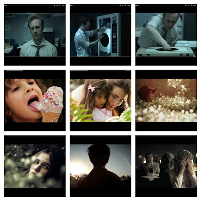
- From the tiles below starting from the top left moving to the right and then starting the new row.
- The first image is taken from when both character meet for the first time, the disruption in the narrative. The next image shows Mario exploring this new 3D world he now lives in. The third image shows both characters contemplating on what to do about this "problem" of Mario being in the real world. Image number 4 shows Mario being "teleported" back into the gaming world. The fifth image shows what is left after Mario is transported back were he belongs. The next image shows the opening title of the film, which is the same font used on the poster for one of my ancillary tasks which I have done to build up this idea of a brand. The last three images on the bottom row show the Gamer sitting down getting ready to play his game, and then the phone rings so he looks away and when he leaves the room Mario (in the last image) is escaping through the TV.

- During editing I created a few different versions of the end product, as well as cutting some scenes out to overcome problems that I couldn't solve on "Final Cut Pro" and "Motion", such as the game cartridge being a different colour to what I wanted, so I cut out the BCU of the cartridge.
Ancillary Tasks
Poster:

- Poster are unique in advertising because it relies on one image alone to catch your attention and appeal to you enough to go out, pay money, and watch their film by giving you lots of information which is contained within a couple of pictures and a bit of text. This is done by revealing to the audience where the film is set, e.g. time period, what characters are going to be in the film, by displaying the main character largely on the poster. Most poster follow simple conventions such as a large title and the main characters printed behind it.

- The text on our poster as well as the character enlarged behind the big title gives communicates to the viewer this film is about "Games" and more importantly "Mario". All poster follow boarders and use guidelines to keep everything on the poster as pleasing to the eye as possible to draw even more attention to the poster. We did this in creating our poster and getting the title completely centre it gives the poster an easy to look at appeal.
Review:

- Our review was based on the layout and design of Little White Lies, a small but popular and success film magazine company based in london. The layout of the reviews in the Little White Lies magazine followed the same format for every one, and includes small details such as a word limit of 550 words a review, and centering the text in the columns which all come together to create a neat and sophisticated piece of writing.
.jpg)
- The layout conventions for my review follows the same as Little White Lies layout. The basic layout of the review is a large wide picture above 550 words of text, with details about the crew in between. The text is Centuary Gothic which is much more aesthetically pleasing than Times New Roman. A dropped cap is used at the beginning of the first paragraph which adds a little touch of creativity and looks more professional
- The language conventions of of Little White Lies is quite unique with puns littered in the text with references to previous films and reviews that only fans of the magazine may understand. A lot of the puns require at least a moderate level of knowledge in the filming world to actors, directors, and quotes from classic films. This little hearted writing style makes it fun to read.
Evaluation Question 2
Script/cues -
Poster


How effective is the combination of your main product and your ancillary tasks?
Script/cues -
Poster
- Taking into consideration this is a student project with low/minimal budget, i feel the whole portfolio would work in a real commercial context because of a selection of different factors.
- Film appeals to younger and older audiences, because the average age of a gamer is now 43, and Mario was in its prime when the older gamers were teenagers.
- The poster works well to capture your attention quickly, by using very high contrast, bright, colours as well as a large vibrant title. This works well to communicate the appeal of our film as our film is reflected in that.
- By looking at the poster, the way Mario is positioned gives the audience an idea of what the story is about, without saying anything, it just subtly suggest he is escaping from his game.
Review
- Written about film, without giving away the story
- Used Indesign
- Little white Lies is appropriate as they review short films
- Same age bracket
What have you learned from your audience feedback?
Because our target demographic were teenagers and young adults that are middle class, social networking was the obvious choice to get audience feedback.

- We used Facebook to ask our audience to choice what film name they preferred.
- The most popular was 'Game Over' followed by 'Mushroom Kingdom'. This is interesting as Game Over would seem to be the most cheesy out of all three, which does reflect what the film is.
- This suggests we have achieved our aim, slightly, by appealing to the light hearted young people. Although under 10 responses is not enough to back up that claim.

- We then used Twitter to ask what film poster they preferred. Again they preferred the more "Cheesy" little hearted poster, further suggesting it appeals to the younger audience. We have learned by getting audience feedback we have achieved to appeal to the younger and more middle class audience.

- Coming to the end of editing we decided to get some last audience feedback, we created to versions of the film, one with no game footage two introduce the film, the other with the footage. Game footage obviously won, this could be because our younger audience want that feeling of nostalgia, thus wanting to see real game footage of a classic video game.
How did you use media technologies in the construction, and research, planning and evaluation stages?
Emma - Evaluation
1- in what ways does
your media product use, develop or challenge forms and conventions of real
media products?
I was inspired by many short films while researching for our own including Apricot, Black Hole and I Am Butterfly... you can read more about these films HERE!
-The main short film that inspired me was ‘black hole’ I
loved the idea of having such a simple narrative and it to be so effective. I
think our film develops this common short film convention of having a simple
narrative by using interesting editing techniques such as the green screening
sequence. what makes of narrative simple is having ONE main character ONE setting and ONE prop of the games console. This is seen in the short film Black hole, the only character is followed as he moves around one space and uses only one main prop.
-in retrospect the greenscreening we were able to achieve was not overly difficult to do but the result of it in the final product is very effective, it also acts as a key moment in our film allowing the narrative to have a purpose.
-Mario coming into the real world and then having to leave to save the princess is a relatively simply story, but the way we showed it on screen challenged the basic convention.


-Our first post was questioning the film’s title, we had chosen three but used audience feedback to finalise a single name.
-The most popular choice of the three was ‘Game Over’ closely followed by ‘Mushroom Kingdom’ and then ‘Get me out of here.’ The feedback was given simply by the audience giving us the letter or number of their chosen title; because it was so easy to leave feedback it meant that a lot more people commented which gave us a wider idea of what to call the film.

-While editing the film together we had a disagreement on whether or not we should include game footage at the opening of the film before the title sequence so we went and spoke to people in our Media A2 course, including teachers and built up a simple tally chart of each version.
-One respondent questioned whether or not the game footage was needed as at that point in the film, the audience have not been introduced completely to the films gaming topic. We thought this over and came to the conclusion that the footage gave an interesting opening and introduction to the film and its content.

-in retrospect the greenscreening we were able to achieve was not overly difficult to do but the result of it in the final product is very effective, it also acts as a key moment in our film allowing the narrative to have a purpose.
-Mario coming into the real world and then having to leave to save the princess is a relatively simply story, but the way we showed it on screen challenged the basic convention.
-The narratie organisation of 'Apricot' is very interesting, it shows flash backs and the present but aslo brings the two together by having the 'past' characters in the present setting. this became one of our main insperations when we were thinking of bringing our own character into our present world. but we decided to use a linear narrative structure for our film unlike the non linear style of Apricot.
-The slow pace of editing, drifting camera work and extreme close ups during this short film also adds to the film as a whole, it gives a magical and calm feeling which brings the narrative to life even more.
-I chose the center image from i am butterfly becasue it shows the close relationship that the two characters share, i wanted to make an intimate friendship between our two characters and found from this film, and others like it that close shots at eye level create an intimate feel, between the characters and the audience themselves.
-Looking at Todorov's narrative therory our film follows a Linear narrative structure we begin with the
equilibrium, the gamer alone at his house, Mario then arrives, this is the 'disruption' and the attempt to repair the ditruption is when the characters play the game to get Mario beack inside the game. after Mario leaves the gamer is back in the same room alone and the equlibrium is reinstated.
-Throughout our film the relationship between our two characters becomes closer and closer, by the end of the film when Mario goes back in to the game only his hat is left, The last shot shows Jonah picking up the hat as if the object means alot to him. The way the relationship grows throughout the film is a common convention from other short films i have looked at such as Apricot and I am Butterfly.

-We used extreame close ups through our film to allow the audience to feel closer to the story, and emotion from the characters. This technique also could create a slightly uncomfortable feeling from the audience because they are so close up to the characters faces.
-Our film uses mise en scene conventions from the comedy genre such as costume. we chose a similar costume that Mario wears in the original games which is brightly coloured and comedic in style. We decided to have our character of Mario in full costume throughout the whole film, instead of making him blend in with the rest of the setting.
-Our film represents young middle classes, we achieved this by using realsim in our filming, sound and editing process, instead of adding lots of unnatural sounds and music through our film we decided to keep it simple and only use nessicary sound our sounds that would be heard in real life.This is why the majority of our sounds are diegetic and are heard by the characters as well as the audience.
-The genre of our film would is both social realist and fantasy, we have a hyper, magical fiction coming to life and entering the real world where people arent used to seeing things like our Mario character dressed in his bright and animated style costume.
Ancillary Tasks.
Poster:
We researched film posters to get an idea of what they include and how they are structured, click HERE to see this research.
We researched film posters to get an idea of what they include and how they are structured, click HERE to see this research.

-Our poster design follows the rules and conventions that others do, the most noticable thing that we found from our research that the majoritiy of film poster include a large image of the main character(s) also allows viewers to see which actors are in the film which could sway their opinions on whether or not they go to see the film.
-The images also give important information about the film itself, we understand key narrative aspects simple my looking at the poster, we can see...
-where the film is set,
-what the characters are like,
-what the characters situation is.
-The title of the film is always the biggest text on the page. this allows no confusion over the name but also appeals to game litterate people as they would recognise the font and style of our title.

-Our poster shows the theme and issues of fiction vs. reality and also gives detail from reviews from 'The Gaudian' and 'Empire' two reviews that are very highly regarded by film fans who we are targeting through having the Mario games as an underlying theme of our film.
-we also followed the layout of other posters by having clear lines and levels that our images and text lined up to on the poster.
-i would say our only issue with our poster and somehting i would chane if we were to do this again, would be to get review quotes from specialist video game magazines as it would appeal to a wider audience demographic and allow people to understand further that our film has a theme of gaming.
-We followed a structure of clear lines and boarders on our poster as many of the posters we looked at had clear alignment of text and images and it makes the poster look more proffesional.
Review:

-Our review layout and style of writing was based on the
format of a Little White Lies Magazine film review, by researching this niche
media product we found details such as the magazine have a word restriction of
550 words per review which helped us make the layout exact.
-The review is aimed at young, intelligent people interested in film and cinema, normally the team at Little White Lies also write for this target demographic so we focused alot of our research on how the revies are actually written, what kind of language do they use and how they explain things.
-The review is aimed at young, intelligent people interested in film and cinema, normally the team at Little White Lies also write for this target demographic so we focused alot of our research on how the revies are actually written, what kind of language do they use and how they explain things.
-We also found that they often use restricted code in their
reviews which allowed us to connect to our target audience through puns and
details they would understand.
Click HERE to see our Little White Lies research.

Click HERE to see our Little White Lies research.

-I think our review was a successful interpretation of a Little White Lies style review, we were able to get the layout the same as LWL by using the programe InDesign.
-Every detail on the page has been given its place through carful planning and measuring on the page, even down to where the word 'review' was placed on the side of the page took planning and carful consideration so that our review looked proffesional.
2- How effective is the combination of your main product and
ancillary tasks?
-Branding our film and both ancillary tasks would be a success as well, becasue we have used the same title style font and colour on our poster and at the start of the film people will begin to recognise it as our brand. it can also be linked back to the Mario Games as it follows a similar style which people, young and old would recognise, building up a successful brand.
-This is also seen by the characters costume being the same in the poster and the film.
-Game over works well as a title becasue is suggests many things including.
-Video Games
-something ending
-something not going well
which all give our adience ideas about the content of our film and get people talking and therefore building up a well known brand.
3- What have you learnt from your audience feedback?
-Our target demographic are young, middle and working class
people aged between 13-21
because of this we decided to post our ideas on to social networking sites Facebook and Twitter because the majority of the ‘friends’ and ‘followers’ on these sites are the same age as our target audience for the film.
because of this we decided to post our ideas on to social networking sites Facebook and Twitter because the majority of the ‘friends’ and ‘followers’ on these sites are the same age as our target audience for the film.

-Our first post was questioning the film’s title, we had chosen three but used audience feedback to finalise a single name.
-The most popular choice of the three was ‘Game Over’ closely followed by ‘Mushroom Kingdom’ and then ‘Get me out of here.’ The feedback was given simply by the audience giving us the letter or number of their chosen title; because it was so easy to leave feedback it meant that a lot more people commented which gave us a wider idea of what to call the film.

-We posted on twitter a choice of two poster designs to see which of the two our target audience preferred and the result was the one we went with of Mario. we chose to agree with the response we got from twitter
-While editing the film together we had a disagreement on whether or not we should include game footage at the opening of the film before the title sequence so we went and spoke to people in our Media A2 course, including teachers and built up a simple tally chart of each version.
-One respondent questioned whether or not the game footage was needed as at that point in the film, the audience have not been introduced completely to the films gaming topic. We thought this over and came to the conclusion that the footage gave an interesting opening and introduction to the film and its content.

-Another reason we used the footage was because it allows us
to see the Mario character in the game and usual animated state before we see
him ‘come to life’ which we don’t see later during the film.
4- How did you use new media technologies in the
construction, planning and evaluation stage?

Sam - Evaluation
1- in what ways does your media product use, develop or challenge forms and conventions of real media products?
After researching four short films which we used as inspiration and also to brainstorm on for our own short film i chose to use the following ; I AM BUTTERFLY (Carlos Florez) - Gone Goodbye (Keith Rivers) - Black hole (Philip Sansom & Olly Williams) - Tick Tock (Ien Chi) which you can find a more detailed account on each element on this film by clicking here!
Out of all four i personally picked i believed that Black hole (Philip Sansom & Olly Williams) had the biggest attraction to me as i felt it covered some of the same ground as ours by having a simple narrative which which rely's more on its editing techniques than complex narrative which we felt would be key in our film. Also with the large amount of green screen work to simulate this Portal/black hole which our initial idea was to create film revolving round an awkward relationship between a gamer and a games character. Which ironically can be related to a much recent blockbuster called Ted (Seth Macfarlane) which covers a man and his 'best friend' in which being his teddy bear. Which relates to our character being Mario which he escapes his animated game and comes reality and then having to leave to save princess peach.

Figure 1
As shown in Figure 1 we can see use of interesting camera angles with a variety of Close ups to long shots i felt as our short film will be will be predominately shot within one or two locations there will be little need for such long shots. For example in Tick Tock (Ien Chi) the use of long takes which as you can see from this short it is taken all in one take, also the uses of time lapses and unusual editing techniques interested me and which in the time lapse sequence of our film relates to this. Along side with our narrative Figure 2 we find that where we start off is where we finish as shown in the film we start with a gamer home along supposedly doing his homework to having a game character join him for a brief period of time and then along again after Mario goes back into the game. Which in some sense relates to a film in the cinema at the moment called Wreck-it Ralph (Rich Moore) which focuses on a old a 8-bit arcade character which leaves his game in search of a gold medal which in the end returns back to his own game before it is turned off.
For instance the narrative in I AM BUTTERFLY (Carlos Florez) is very interesting, it shows the child with her mother which is spoken via a a childs sing song. Then throughout a various events we are shown we a turn of this became one of our main insperations when we were thinking of bringing our own character into our present world. but we then take our character out of the world like the example shown here where the mum is taken from the child. this made us decide to use a linear narrative structure for our film unlike the non linear style of Gone Goodbye (Keith Rivers) .The slow pace of editing, long takes in camera work in I AM BUTTERFLY (Carlos Florez) and extreme close ups gave inspiration to our film as we would be shooting in 1 location show it made we can experiment with our techniques.
As shown in Figure 1 I chose the bottom 3 images from i am butterfly because it shows the character relationship of the mother and daughter which is illustrated through the non diegetic and diegetic soundtrack which is used as the script as well. This in particular shows the relationship of the two family members, which we wanted to adapt to our gamer character and Mario charcters which would be easierly done by camera angles such as close shots at eye level create emotion, between the characters and the audience themselves.
Looking at some narrative theory for example we can apply Todorov's narrative therory to our film follows a linear narrative which we begin with the equilibrium the character we start with is our gamer who is home alone alone at his house getting ready to play some retro games. The the Disruption which is ofcourse where our Mario character then arrives this is then followed by an attempt to repair the disruption which is when they decide to have a intense session of gaming in which is where the charcters play the game to decide whether to get Mario beack inside the game or for him to say. Followed by after Mario leaves the gamer is back in the same room alone and the equlibrium is reinstated.

Figure 2
The relationship between the two characters becomes closer and closer, by the end of the film when Mario goes back in to the game only his hat is left. This is shown by his emotions by a variable of close ups and panning shots which gives you as the spectator a chance to see how the charcter is feeling at this time. The last shot shows the Gamer picking up the hat as it is a symbol of that he will remember this moment. The way the relationship grows throughout the film is a common convention from other short films i have looked at such as Gone Goodbye (Keith Rivers) and Tick Tock (Ien Chi).We used a variety of different Angles and shots in our film due to only using one location meant we had time to create interesting angles and shots to experiment with. For instnace the use of extreme close ups through our film to allow the audience to feel the emotions of the characters and pulls the spectator closer to the story. This technique also could create a slightly uncomfortable feeling from the audience like for example when Mario is first introduced we are shown with two characters expressions, especially Mario's which is an extreme close up to gather the emotion of the character but in this case a sense of uncomfortable feeling.
Our film uses various elements misé en scene which can be related to the conventions of the comedy genre such as costume. For instance our costume relates to the Mario franchise as we chose a similar costume that Mario wears in the original games which has vibrant colours of red and blue which is also brightly coloured and comedic in style like for example the newest game refenced film Wreck-it Ralph (Rich Moore). We decided to have our character of Mario in full costume throughout the whole film, instead of making him blend in with the rest of the setting.
We chose to represent our film around the demographic of young middle classes, we achieved this by using references to a video game which was infamous around the 90's and early 000's on the N64 and also the use of realism in our filming this can be seen by our minimallistic editing and sound affects and using a naturalistic colour scheme. This is why the majority of our sounds are diegetic and are heard by the characters as well as the audience. The genre of our film represents various conventions of a social realist and comedy.
Ancillary Tasks.
Poster: CLICK HERE TO SEE MY POSTER RESEARCH

Figure 3
The initial design of the poster was to follow some of the conventions that films and particular genres have in common. From my research the majority of film posters included a large image of the main character or location which will instantly tell the spectator what the film is aim at or about. Also almost every film poster i found had a large header which would attract the title of the film by using always the biggest text on the page. This meant that the billing block and reviews or staring cast will not be confused with the film Title. The images also give important information about the film itself, for example we can get ; the film location, the characters first impression and their posture. The title of the film is always the biggest text on the page. Our poster shows the theme and issues of fiction vs. reality this is portrayed between our characters where we have a fiction character being Marion and the reality being our gamer. Also the detail from reviews from 'The Gaudian' and 'Empire' two reviews that are very highly regarded by film fans where they can get the first impressions of the film which would also give their target audience. we also followed the layout of other posters Figure 3 for example like Shrek in the sense of the colour scheme being we have a traditional Mario Background and character. There could be an improvement as due to the use of websites and magazines game review posts and articles are now more frequent for example like http://uk.ign.com/ which give daily news on all types of media like games and films which would be valuable on the lines of the poster as it would attract a larger demographic.


For our review we were tasked with recreating our own stylish Little White Lies article which bases its audience on high educated film goers and also with the occasional game review this meant that our layout and style of writing was based on the format of a Little White Lies and how it would look in any of their magazines. By researching this niche media product we found details such as the magazine have a word restriction of 550 words per review however we found working with tiny bit under worked perfect as the Aprijita font used would of made the pxt size to small for the viewer to read. ''restricted code'' was a common style was used in their reviews which allowed us to connect to our target audience in many references and cheeky puns which makes the article more interesting.
Our target demographic is for the young, middle classed intelligent people interested in film media this is also chosen by Little White Lies for their review so we also write for this target demographic so we focused alot of our research on how the review are actually written. For the layout i think our review was a successful interpretation of a Little White Lies style review as using In design opened many capabilities of creating a perfect layout.

3. What have you learnt from your audience feedback?
The initial target demographic was to be focused on the young, middle and working class people which meant the ages around low teens (13) to young adults (21) because of this would help with the references in the film about Mario and about certain props. Also with he coming of technology we are now able instead of doing a hand writen questionnaire we can simply ask for people to comment on our wall (in this case we used Emma Lambert's pages) on to social networking sites Facebook and Twitter because the majority of the people correctly given as ‘friends’ on Facebook and ‘followers’ on twitter which also have a huge following in particular our target demographic.


ON twitter using Emma's account we posted our two poster designs which again like with the 3 titles to chose from we wanted a more broadened opinion and the result was the one we went with the one with Mario featured on the front.
Whilst in the editing process we now had to decide whether we stick text and leave it as that then move into the film or use some game footage provided my Myself which you can see the process of how i did it here. We went and spoke to people in our Media A2 course, including teachers and built up a simple tally chart of each version.

We thought this over and came to the conclusion that the footage gave an interesting opening and gives a sense of nostalgia to most of our audience as it was a iconic title for most of the kids born in the 90's on the N64 which would introduce to our film quite nicely
4- How did you use new media technologies in the construction, planning and evaluation stage?

Subscribe to:
Posts (Atom)